Firefox Send
Firefox Send is a file transfer service that automatically deletes files from the server after one download or 24 hours — whichever comes first. Files are encrypted end-to-end, and the link that gets shared never has to pass through Mozilla's servers in a readable form. The challenge was making something technically complex feel completely ordinary to use, while giving users enough clarity about what was happening that they actually trusted it. I was responsible for the UX flow and contributed to some of the front-end implementation. The visual direction came from a visual designer on the team; I collaborated closely with her throughout, making sure the flow and the visual layer worked as a coherent whole.
The Context
Test Pilot was Mozilla's framework for experimenting with features outside of the core Firefox browser. Shipping as a web experiment meant two things: no friction to entry (anyone with a browser could try it), and a real expectation that user feedback would drive what came next. This wasn't a finished product — it was a first version designed to be learned from.
That context shaped how I approached the design. The goal was a complete, trustworthy experience that worked well enough for real users to tell us what to build next — not a finished product.
The Design Challenge
File transfer sounds simple: upload a file, get a link, share it. The user flow is short. That simplicity is exactly what makes it hard to design well.
When the happy path is three steps, every edge case becomes proportionally more important. A user who hits an error, receives an expired link, or isn't sure whether their file actually uploaded successfully has very little context to fall back on.
For an encrypted file-sharing service, the product's credibility depends entirely on users feeling confident handing something private to a service they've never used. If the experience feels incomplete, ambiguous, or confusing at any point, it undermines the core promise even if the encryption is working perfectly. Edge cases were where that confidence was most at risk, which made them the real design problem on Firefox Send.
Designing the Flow
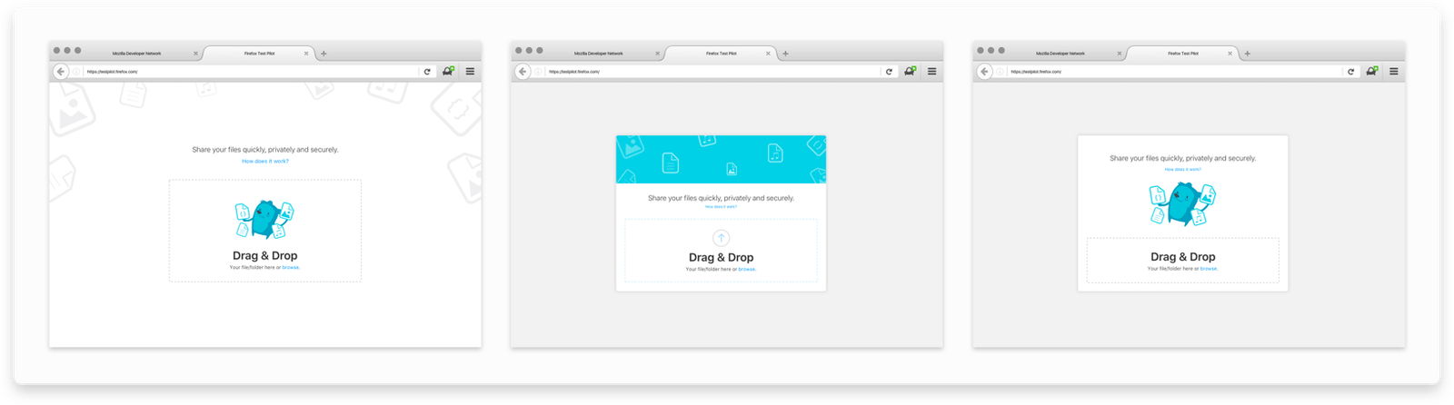
I started with wireframes to establish the interaction structure before any visual decisions were made. The user research team was running parallel investigations into what users actually understood about file sharing and encryption — the wireframes served as prototypes to validate assumptions about the flow and surface confusing moments early.
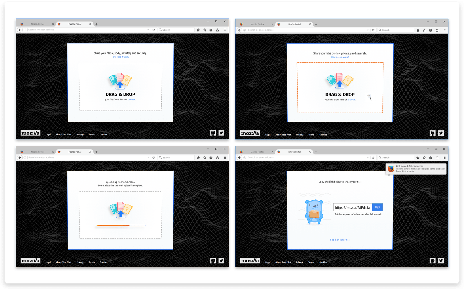
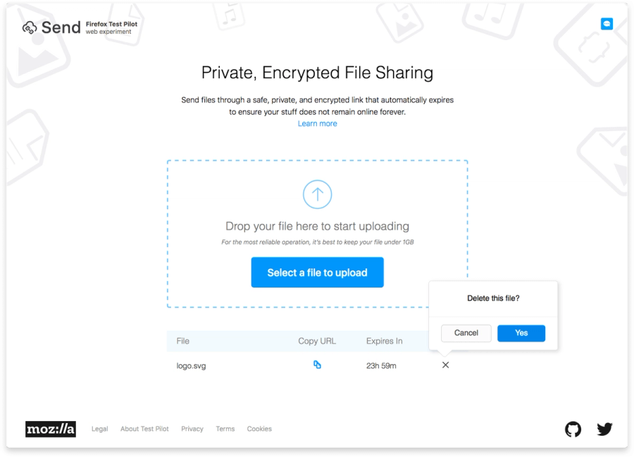
The core flow had four states: the upload surface, the in-progress state during upload, the success state with the shareable link, and the recipient's download screen. Within each of those, I mapped the failure and edge case variants: what happens if the upload fails, what does the recipient see if the link has already expired, how does a user delete a file they've already shared, what does the page look like if someone tries to access a link that never existed.
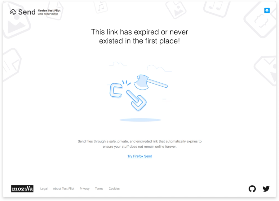
The expired link case was the one I spent the most time on. It's a moment where the user has zero context — they clicked a link from a message or email, they don't know what it was, they don't know if it expired because someone downloaded it or because 24 hours passed. The copy and illustration needed to communicate "this isn't an error, this is the service working as intended" without feeling cold or dismissive. The tone we landed on — "This link has expired or never existed in the first place" — was deliberately plain. It acknowledges both possibilities without suggesting failure on either side.
Making Simplicity Feel Secure
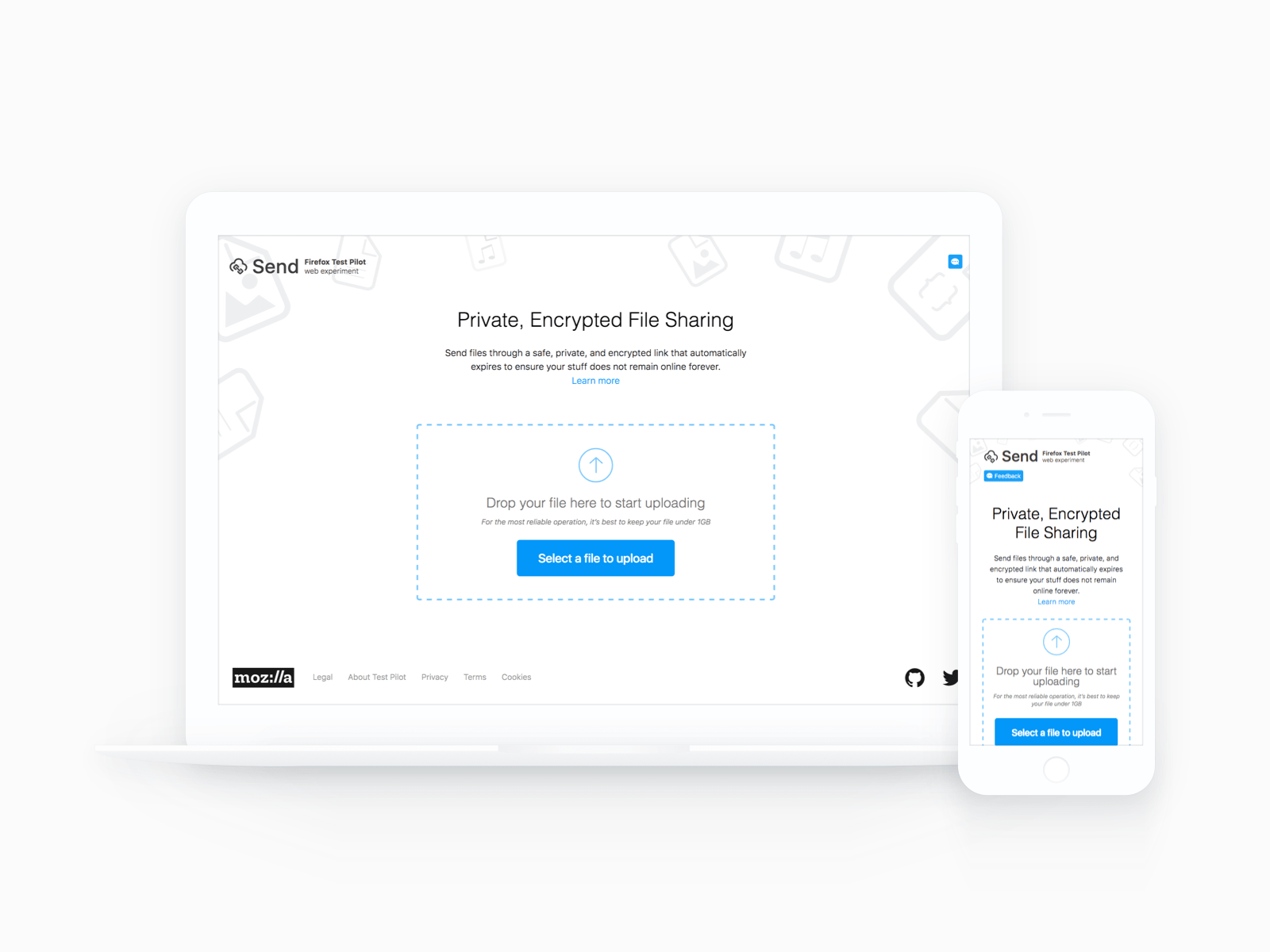
The upload screen had one job: get users to drop a file or click a button, without making them think too hard. But it also had a secondary job: establish enough trust that users felt comfortable sharing something private through it.
The tension between those two things shaped every decision about what to show above the fold. Show too little and users wonder whether this is real. Show too much — encryption details, legal language, technical explanations — and the simplicity that makes it appealing disappears.
The approach was to put the action first and explain just enough. The upload area was the dominant element. The value proposition — "private, encrypted file sharing" — appeared as a clear headline. A "Learn more" link was available for users who wanted to understand the encryption before committing. For users who were already comfortable, nothing in the flow would slow them down.
After the UX structure was established, the visual designer brought the interface to life. We explored several directions — different approaches to color, illustration style, and how much visual personality the product should carry. The final design landed on a clean, light aesthetic with friendly illustration, leaning into approachability rather than the technical precision that might have felt more "secure" but would have been less inviting.
Responsive Across Everything
Because Firefox Send was a web product with no installation requirement, the responsive experience wasn't optional — it was part of the value proposition. The service needed to work on whatever device the recipient happened to be on when they received the link.
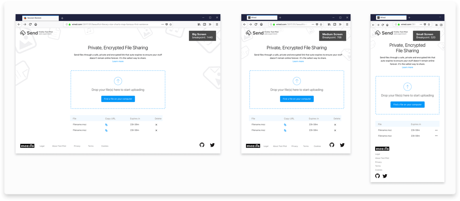
I designed the layout across three breakpoints, with the upload area as the constant anchor. The structure adapted without losing its clarity at any size: the action stayed front and center, and the supporting information reordered around it. One specific challenge was localization — Firefox Send shipped with string support for multiple countries, and some translated strings were significantly longer than their English equivalents. This meant some components needed to be reconsidered structurally, not just translated.
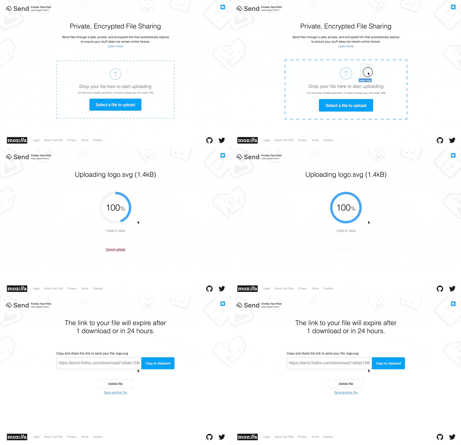
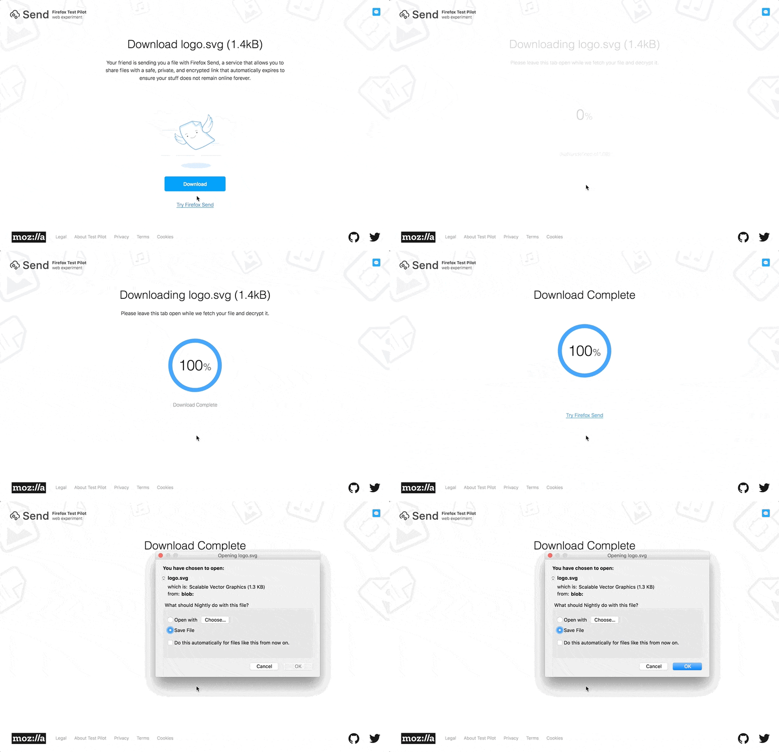
Before the experiment launched, I also helped push pixels on the front-end side to make sure the components were implemented consistently with the design. Small visual inconsistencies that are easy to accept in a mockup become more visible in a live product, and it was worth the extra time to get them right.
What Users Said Next
After launch, Firefox Send attracted press coverage and generated over a thousand upvotes of feature requests and feedback. The team collected everything into a prioritized backlog.
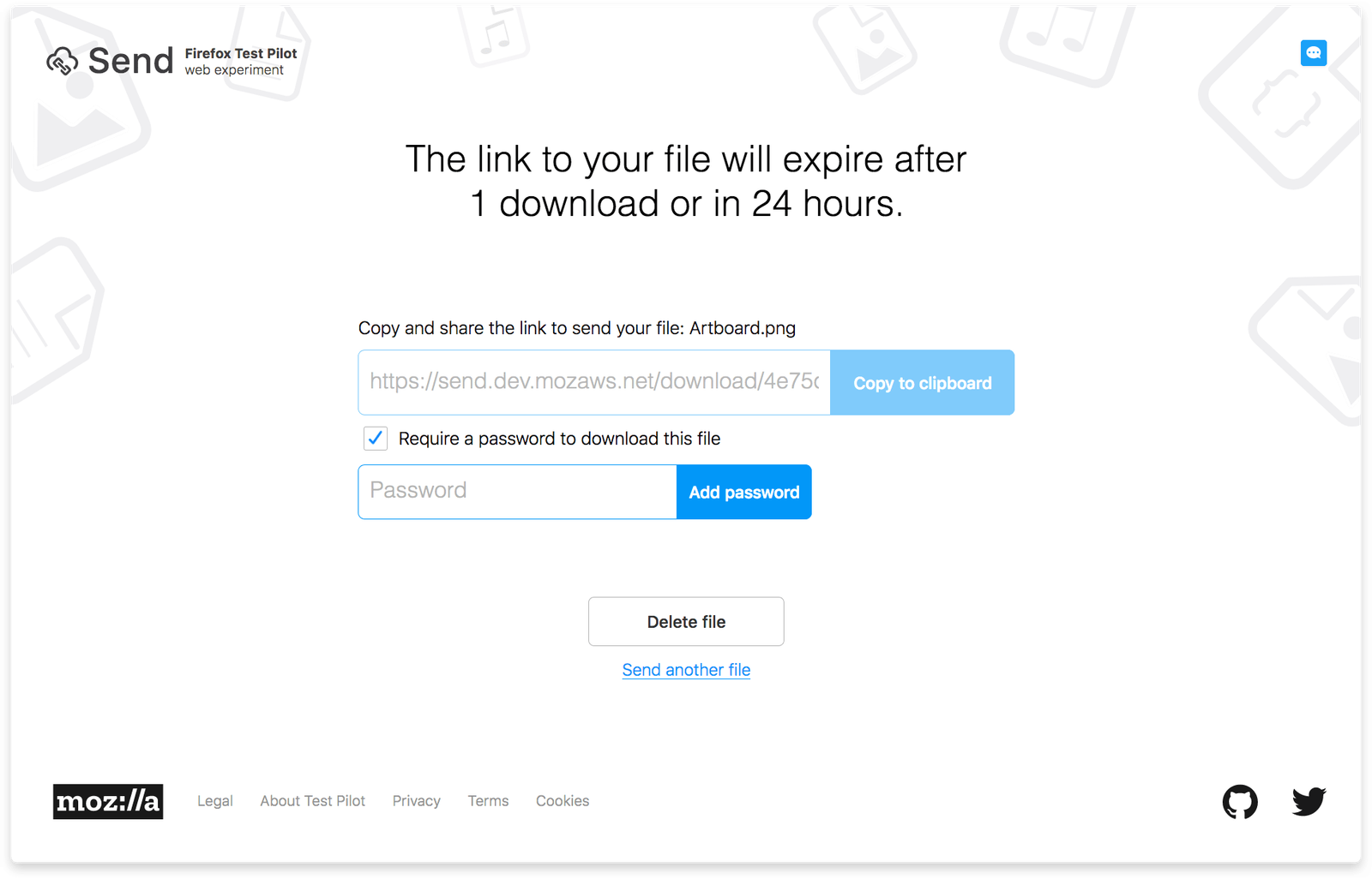
The most requested feature by a significant margin: password protection. Users wanted the ability to add a password to a link before sharing it — an additional layer of control on top of the encryption and expiry. We designed and implemented it, surfacing it on the success screen where it felt natural: after a file was uploaded, before the link was shared.
The password feature was a good example of the experiment model working as intended. We hadn't included it in v1 because we weren't sure how many users actually needed it. The feedback made the answer unambiguous. We built what users asked for rather than what we'd assumed they might want.
Reflection
Firefox Send came early in my career and clarified what interests me in product design: the gap between a flow that works and one users trust.
Encryption, auto-deletion, and cross-browser support didn’t matter if people didn’t feel safe sharing private files with an unfamiliar service. That confidence came not from explaining the tech, but from many small decisions—clear copy, well-handled edge cases, and a thoughtful upload experience.
What I’d change is investing earlier in understanding why users needed encrypted transfer—what they sent, to whom, and what risks they managed. We had general research, but sharper insights could have guided v1 scope. The strong demand for passwords after launch suggests we could have anticipated it.
That said, the experiment model made this less critical. Launching without passwords and adding them from feedback was likely right—but anticipating it would have been more satisfying.