Firefox Lite
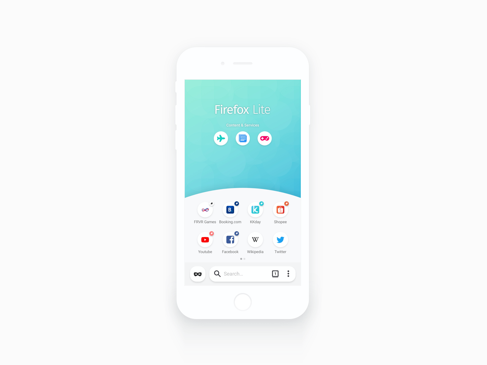
When I joined the Firefox Lite team at Mozilla, the app had 1M MAU in emerging markets, but weak retention—users tried it, then left. I was brought in as both PM and UX designer, owning strategy and experience end to end, shaping both what to build and how it should feel. Over 12 months, I co-led Firefox Lite 2.0 and 2.5 around one thesis: a browser becomes sticky when it gives users a reason to return. By introducing a curated Content & Services layer, Shopping Search, and Home Customization, we grew MAU from 1M to 1.6M in 7 months and passed 5M installs.
The Problem
Firefox Lite 1.0 had a clear value proposition for emerging markets: fast, lightweight, data-saving. In markets like Indonesia, where users are on constrained data plans and entry-level Android devices, those properties matter enormously. The problem was that "fast" is a threshold quality — once you're fast enough, it stops being a differentiator.
The data confirmed what fast alone couldn't sustain. Users were downloading Firefox Lite, using it a handful of times, and switching back to whatever they had before — or to Chrome, which despite its weight, had the advantage of familiarity. Retention was the gap we needed to close.
The question I put to the team was sharper than "how do we improve the browser?" It was: what does a browser need to become for someone in Jakarta or Surabaya to open it by habit, every day?
Research gave us the answer. Users in our target markets weren't just navigating — they were browsing to shop, to find deals, to read news, to play games. If we could surface those things inside the browser, we could make Firefox Lite the default starting point for those behaviors, not just a transport layer to get to them.
Insights & Framing
Our research combined user interviews, behavioral data, and competitive analysis across Southeast Asian markets. Three insights shaped everything that followed.
Browsing in emerging markets is heavily task-driven. Unlike desktop users who browse exploratorily, our users had specific goals — find a deal, check scores, read trending news. A browser that helped them get there faster than opening a separate app had a real opening.
Customization correlated directly with retention. Usage data showed that users who customized their home screen — pinning their preferred topsites, choosing a theme — had significantly higher engagement and came back more. The implication was clear: a personalized browser felt like theirs. A generic default didn't give them a reason to come back.
The first-time experience was breaking before it could convert. Looking at our onboarding funnel, I found that a meaningful portion of new users never reached the customization step — the original first-time experience was a feature tour that frontloaded information rather than action. Users were bouncing before they ever had a reason to stay.
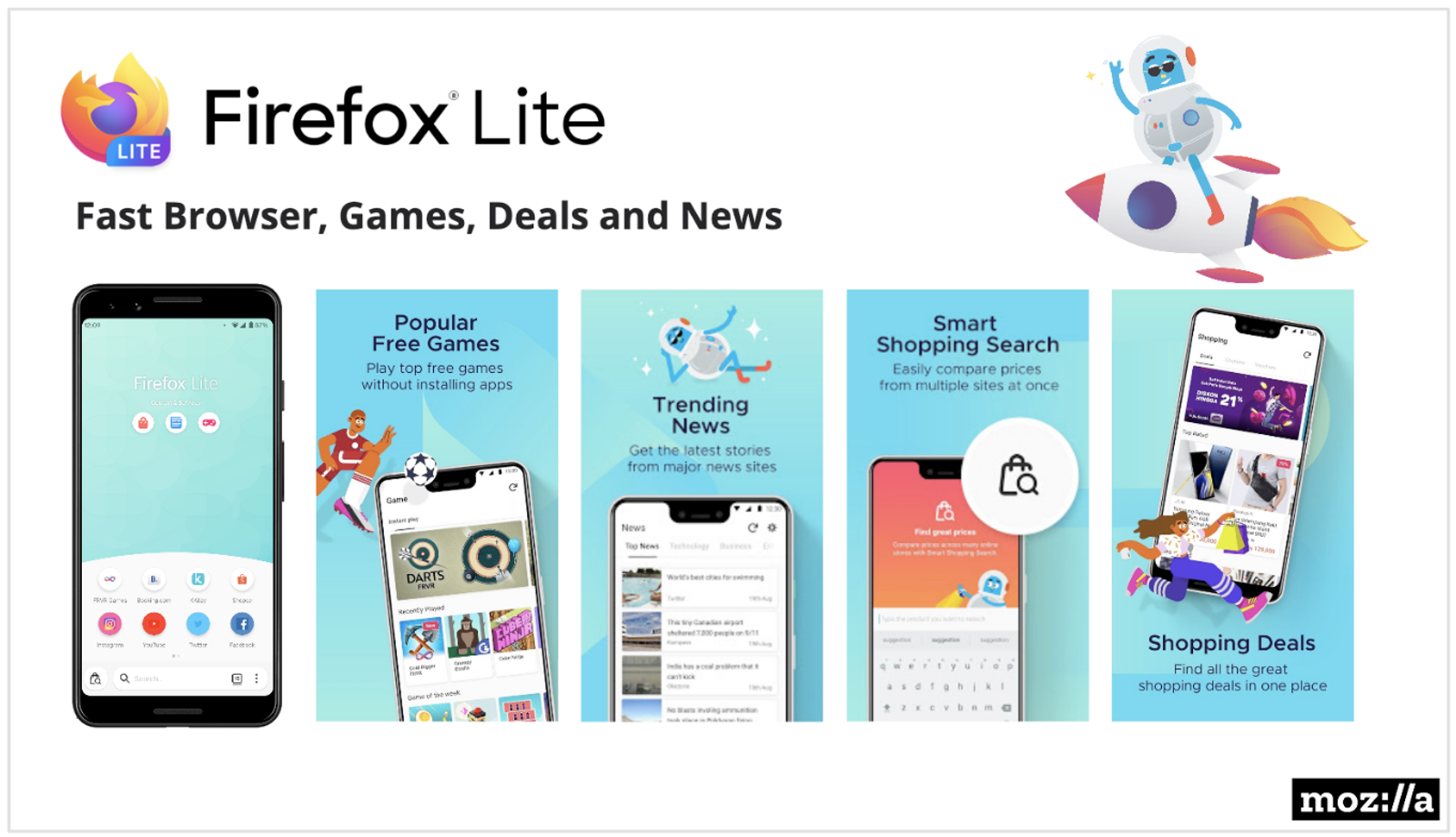
These three insights mapped to two distinct product bets: a Content & Services layer (Shopping Search, Games, News) to give users a daily reason to open the app, and a redesigned Home Customization experience to make sure they personalized it before the first session ended.
Firefox Lite 2.0 — Shopping Search
The Opportunity
Shopping is one of the most common browsing behaviors in our target markets. But the experience was fragmented — users would search on one site, manually navigate to another to compare, then go back. There was a real UX gap, and one that aligned with a business opportunity: by driving traffic to partner shopping sites, we could open a revenue channel for Mozilla.
I was responsible for the product design and specification of Shopping Search; the business model and partner relationships were established by the BD team. My job was to design an experience that made the value obvious and the behavior natural — without it feeling like a search engine replacement.
The Design Decision
The core question was where Shopping Search should live and how it should trigger. I considered three approaches:
The first was a dedicated tab — a separate shopping destination in the browser's tab bar. This would have given it maximum visibility but felt like a separate product, not a native browser feature. It also required users to consciously switch contexts, which broke the flow of natural browsing.
The second was passive surfacing — detecting shopping-related URLs and suggesting the comparison feature contextually. Elegant in theory, but technically fragile and easy to miss.
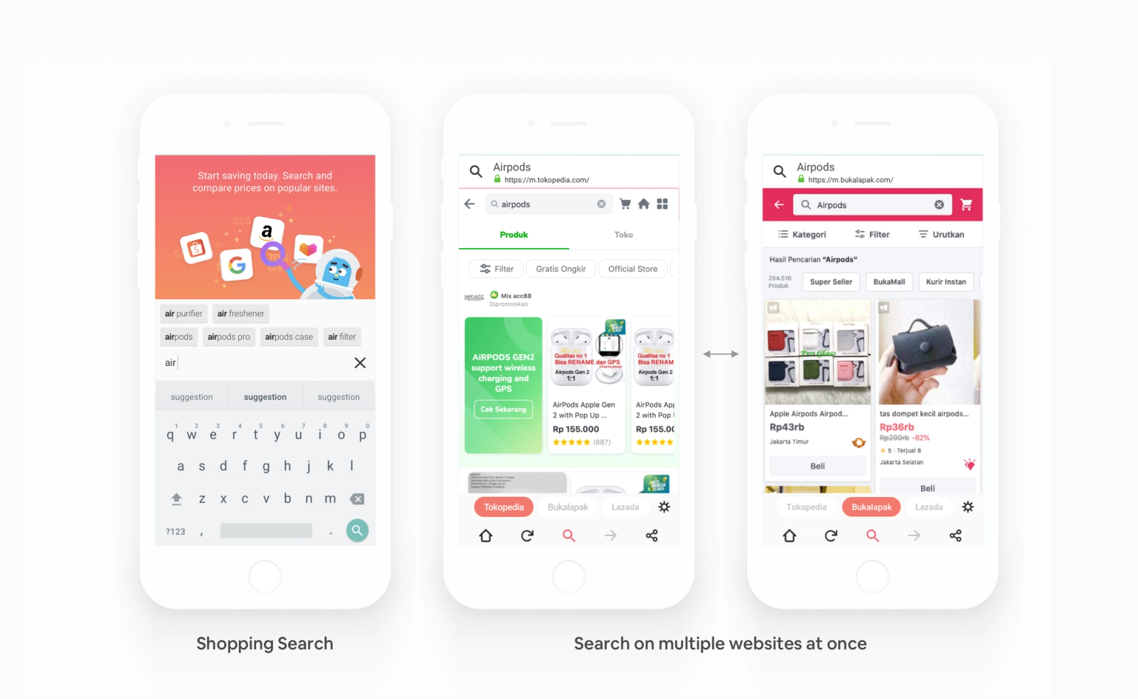
I landed on a third approach: a prominent Shopping Search entry point on the home screen, triggered intentionally by the user. The logic: users who want to compare prices already know they want to compare prices. The barrier wasn't discoverability of the idea — it was friction in the action. A single tap from the home screen that opened a search-and-compare interface across multiple shopping sites was the right trade-off between visibility and intrusiveness.
The trade-off I made consciously was breadth over depth. Shopping Search would show results across multiple platforms simultaneously — Tokopedia, Bukalapak, Lazada — but wouldn't go deep into individual product pages or offer filtering. This was the right call for a v1: the primary user need was "show me what this costs elsewhere," not "help me build a purchase decision." We could add depth in iterations.
Execution
I partnered with BD and engineering throughout the build. One thing I pushed for was keeping the UI surface minimal — no new navigation layer, no separate section. The home screen icon, the search input, the tabbed results. Three surfaces. Engineering appreciated the constraint; it also meant we could ship faster and learn from real usage before adding complexity.
Firefox Lite 2.5 — Home Customization & Awesome Bar
Two Features, One Thesis
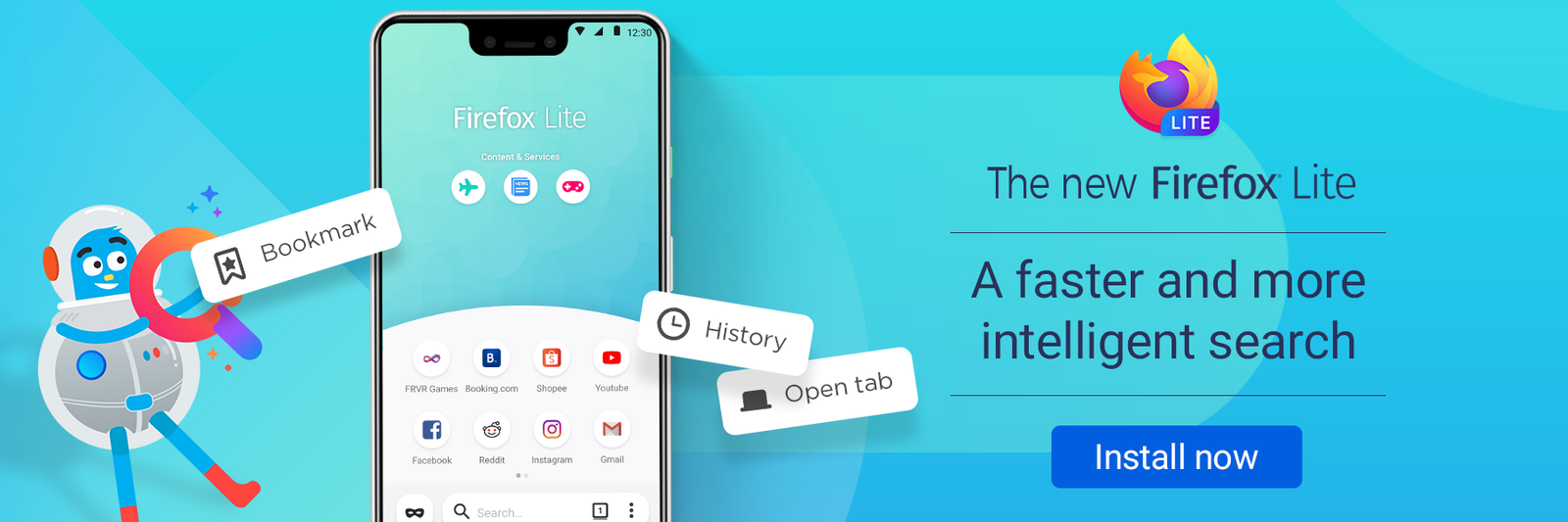
For 2.5, I led two parallel tracks: the Awesome Bar search enhancement and the Home Customization redesign. The Awesome Bar work — smarter history, bookmarks, and tab suggestions surfaced as you type — was relatively contained. Home Customization was the bigger strategic bet, and the one where the earlier retention research paid off most directly.
The Problem Within the Problem
The data on customization and retention created an obvious hypothesis: if we could get more users to customize their home screen, we'd improve retention. But when I looked at where users were dropping off in the onboarding funnel, the opportunity was even more upstream.
The original first-time experience opened with a feature tour. It told new users about Content & Services, showed them what the browser could do, and eventually offered some customization. The problem was sequencing: we were selling the product to people who had already installed it. What they needed was a hook — something that made the browser feel personal within the first 60 seconds.
The Redesign
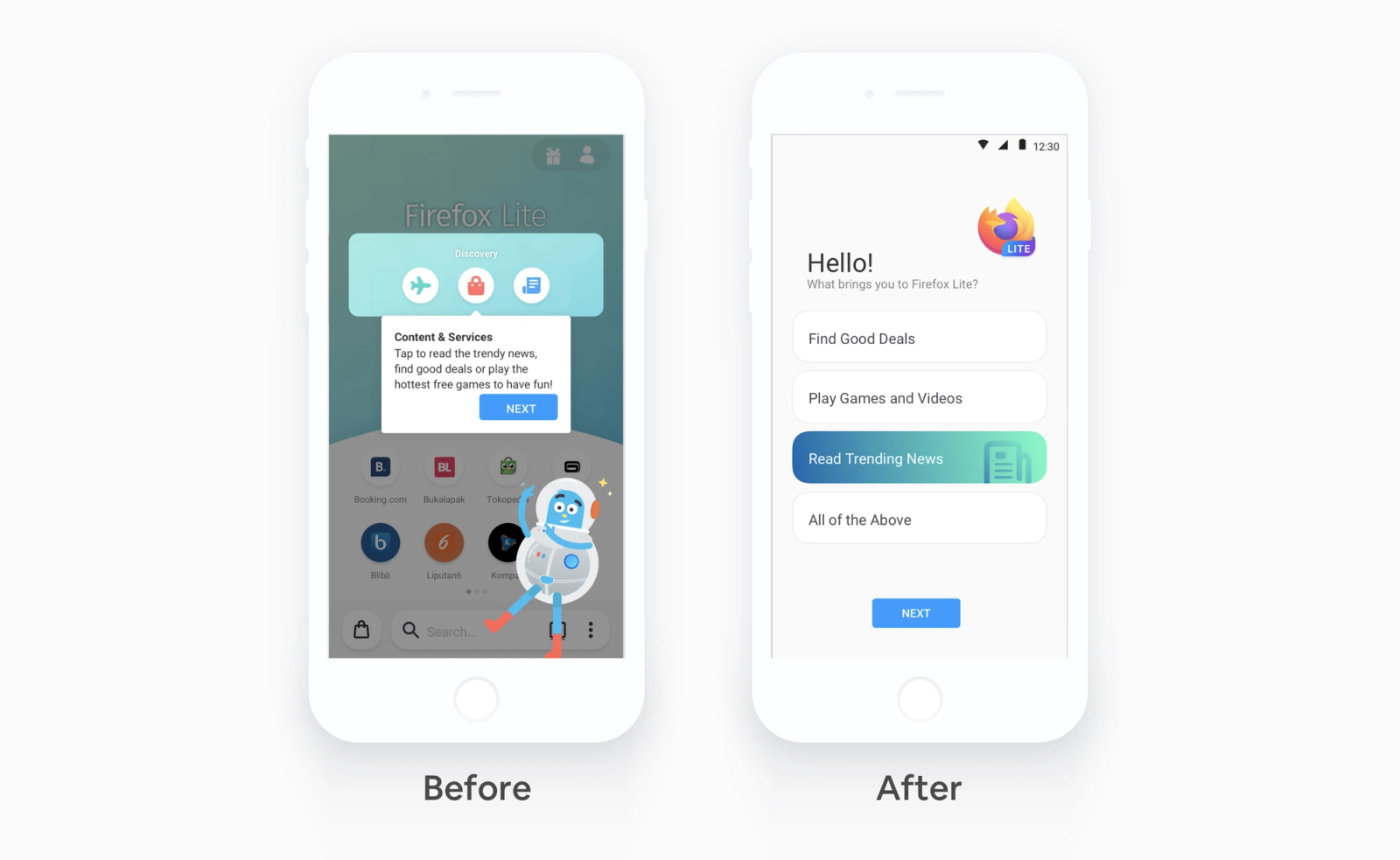
I reframed the first-time experience from a feature demonstration into an intent-driven setup. Instead of "here's what Firefox Lite can do," the new onboarding started with: "What brings you to Firefox Lite?" — with four options: Find Good Deals, Play Games and Videos, Read Trending News, All of the Above.
That single change accomplished several things. It gave users agency immediately. It personalized the content recommendations shown on their home screen from the first session. And it created a mental model — "this browser is set up for me" — that the feature tour never could.
The rest of the onboarding followed naturally: topics of interest, wallpaper choice, default browser prompt. Each step built on the previous one, and by the end, the user had a home screen that reflected their actual intent — not a generic default.
Topsite Customization
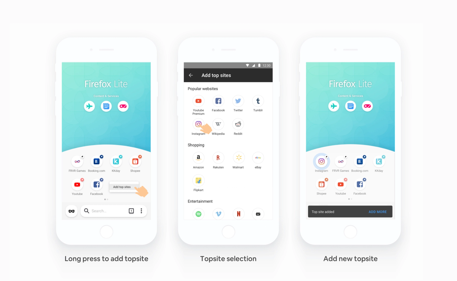
The other piece of the Home Customization work was Topsite — the sites pinned to the home screen for quick access. This is one of the most-used features in Firefox Lite post-onboarding, but the original design only allowed removal, not addition. Users who wanted to add a site had no path to do so.
I added the ability to browse a curated list of popular sites by category (Social, Shopping, Entertainment) and add them to the home screen via long-press. It was a small change in complexity but a meaningful one in perceived ownership. A home screen you built feels different from one you inherited.
Process & Team Leadership
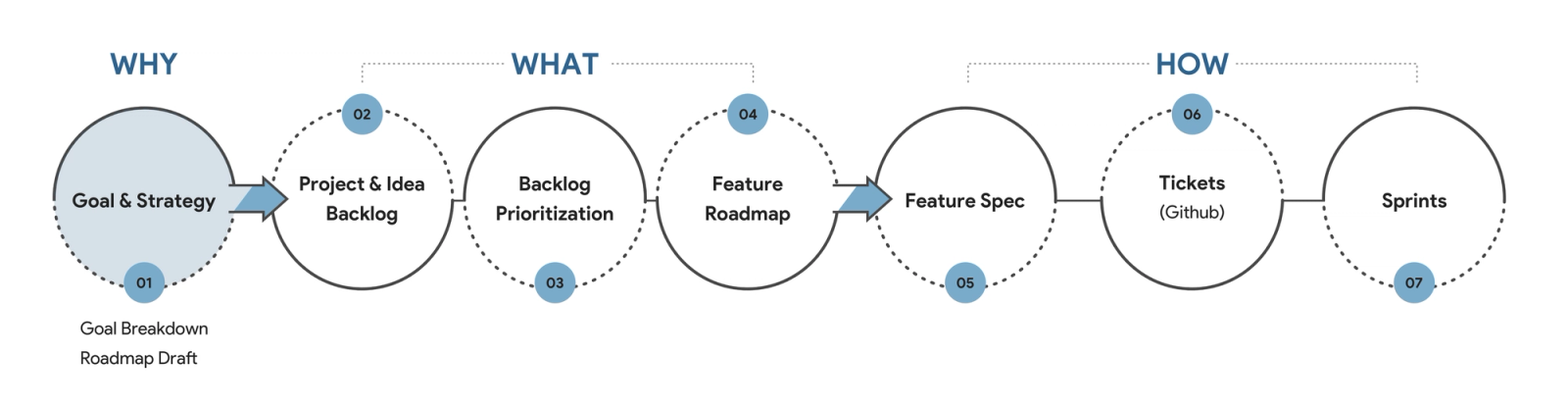
One thing I invested in alongside shipping features was how the team worked. Partnering with another PM, I co-designed the product development process we used across both releases: from setting goals and building the idea backlog, through prioritization and roadmapping, to feature specs, metrics definition, and sprint execution.
The process had a deliberate shape. It started with the why (product goal, strategy), moved to the what (backlog, prioritization, roadmap), and only then got to the how (specs, tickets, sprints). This sequencing mattered — it kept the team from jumping to solutions before the problem was well-defined, and it gave us a shared language for debates about scope and priority.
Within sprints, we ran a recurring set of syncs — data review, PM/UX alignment, go-to-market, spec review — designed to keep everyone oriented without over-meeting. For a team shipping at the pace we were, having predictable touchpoints was what allowed async work to move fast in between.
Impact
The results across both releases:
1M → 1.6M monthly active users in 7 months following the 2.0 launch — 60% growth.
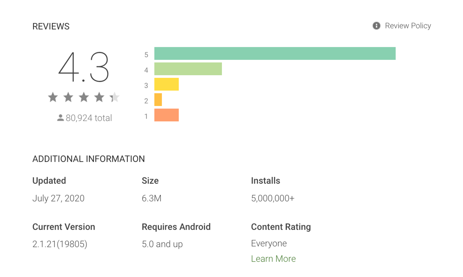
5M+ total installs with a 4.3-star rating across 80,924 reviews — a signal that the new features were landing positively with users, not just driving installs.
19K daily active users, reflecting a real improvement in habitual return — the underlying retention thesis behind the entire 2.0 and 2.5 strategy.
The Home Customization redesign in particular addressed the specific dropout problem I'd identified in the onboarding funnel. The before/after first-time experience shift — from feature tour to intent-driven setup — was the design decision I was most confident about going into launch and most satisfied with afterward.
What's Next
After 2.5, the data pointed toward download management as the next retention lever. Downloads are one of Firefox Lite's most-used behaviors — users in emerging markets frequently download media, APKs, and documents — but the experience had meaningful gaps compared to what power users needed.
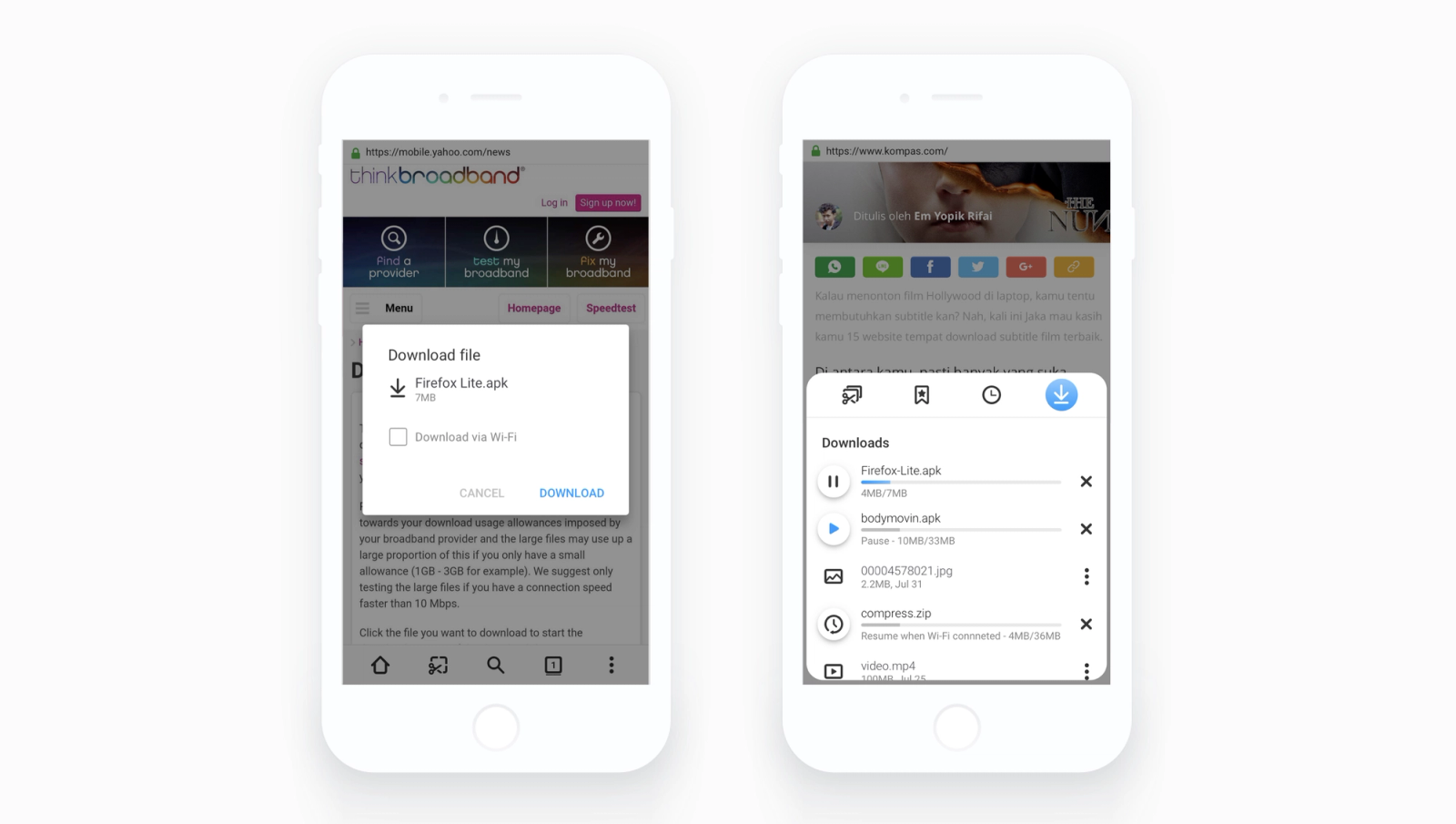
I began scoping the Download Management feature before the end of my time on the project: better in-progress visibility, download history organization, Wi-Fi-only download options for large files. The groundwork was laid; execution passed to the team.
Reflection
The dual PM+Designer role was the most formative part of this project. It’s productively uncomfortable—you can’t defer decisions to the “other role.” Holding product and design questions together forces clarity and momentum.
What I’d do differently is invest earlier in qualitative research on retention before 2.0. We had behavioral data, but more interviews with churned users could have revealed clearer hypotheses and surfaced the onboarding insight we only acted on in 2.5.
The features we built were the right bets. But the first-time experience, the part that had nothing to do with new features, turned out to be where the retention leverage was. That was the thing I would have acted on a full release earlier.
Outcome
1M → 1.6M monthly active users in 7 months (60% growth). 5M+ total installs, 4.3-star rating across 80,924 reviews. 19K daily active users, reflecting a real improvement in habitual return.