KKBOX Design Playbook
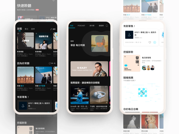
When I joined KKBOX, the design team had shrunk to two product designers. The existing Sketch design system hadn't been updated in years. In practice, designers were finding old files to reference rather than pulling from a living library. On the engineering side, components that looked identical were often built twice by different squads — and behaved slightly differently as a result. Over two years, running parallel to the product revamp and everyday project work, I led the team to build a Figma-based design system from the ground up — completing four phases from product audit to a documented component library and an internal Playbook site. The system became the clearest win when new designers joined and could get up to speed on the product interface without starting from scratch.
The Problem (Multiple Versions)
One of the first things I noticed was that different people had different understandings of what the problem actually was.
Designers found the transition to Figma painful. The old Sketch files were outdated, and nobody on the team had deep experience building Figma components properly. Getting everyone aligned on a single way of working felt daunting on top of existing project commitments.
Engineers were struggling with a different issue: they couldn't reliably tell which UI elements had been componentized in the codebase and which ones just looked like they had. The result was duplicated implementations, inconsistent interactions, and mounting debt that made every new feature harder to build cleanly.
Leadership had a more pragmatic concern: would this effort produce something the product actually used, or would it become an elaborate file-organizing exercise that didn't touch the live product?
All three concerns were legitimate. And all three pointed to the same root issue: there was no shared foundation — no common language, no single source of truth — that let design and engineering make consistent decisions across the product.
Rather than trying to solve everything at once, I focused on making something designers could actually use first, then letting that usage create natural leverage for engineering adoption.
Deciding What Not to Do
Before building anything, I had to make two calls that shaped the entire project.
Decision A — App first, not all platforms at once.
Tackling iOS, Android, and Web simultaneously was tempting. I chose App instead: highest user volume, most concentrated development resources, and the platform where UI consistency mattered most visibly. It was also the platform where UI consistency mattered most visibly. I chose App first and accepted that Web and the marketing site would benefit later. That constraint kept the team's energy focused rather than spread across too much surface area.
Decision B — Embed into projects rather than wait for dedicated engineering resources.
Early on I confirmed what I already suspected: there was no path to a dedicated engineering squad for design system work in the near term. The options were wait for resources that might never come, or find a different model.
I chose to embed design system adoption into existing squad work. Designers in each squad would identify components within their current projects that belonged in the system, propose them during planning, and have the engineering conversation with their own squad about componentization. One component at a time, in the natural flow of project work.
This meant the rollout would be slower and patchier than a top-down implementation. It also meant it would actually happen — and that engineers would develop ownership over the components they helped define, rather than receiving a system handed down from design.
Four Phases
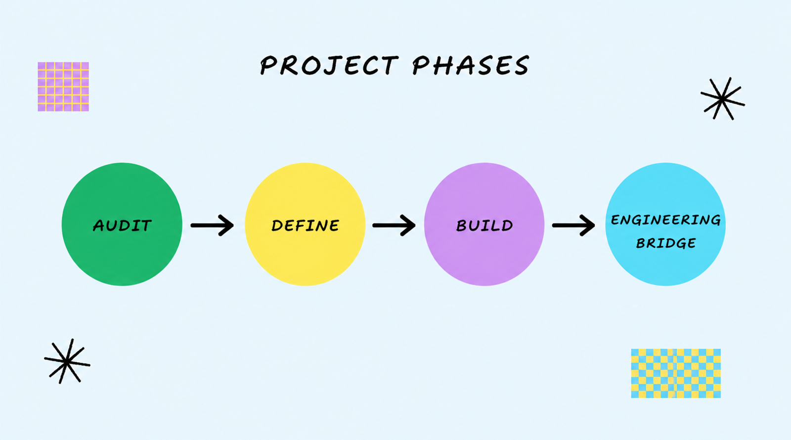
Phase 1 — Audit
The first phase was the least glamorous and the most necessary: mapping every component in the existing product. Designers went screen by screen, recording each element, its states, and its behavior, then cross-referencing with engineers to understand what had and hadn't been componentized in the codebase.
My role during this phase was logistical. I broke the audit into trackable chunks, monitored progress, and flagged blockers early. The audit revealed more inconsistency than anyone had fully registered: elements that looked identical on screen had often been built separately by different engineers, with subtle differences in behavior that weren't visible until you looked for them. That finding made the case for the system more concretely than any argument from principle could have.
Phase 2 — Define
With the audit done, we defined what the system would actually contain: color system, typography, icons, and UI components. We also established how the files would be structured — Mobile (iOS and Android shown side by side) and Web as separate component libraries, with a shared foundations file for color and type.
I had the team research existing design system examples from other companies to calibrate what "good" looked like and what we could realistically reference. The target was a scope a team of two could build and maintain while running full product work alongside it, not the comprehensiveness of a Shopify Polaris or Material Design.
Phase 3 — Build
Building the Figma library was where the team spent the most time, and where the most learning happened. Designers were still developing fluency with Figma's component and variant system while simultaneously trying to apply it to a real product. That combination required active facilitation rather than just task assignment.
The approach that worked best: the designer with the strongest Figma skills led by example, walking the team through her process for building components — how she structured variants, named properties, handled edge cases. Watching an expert work live was more effective than any written spec. I held weekly design system meetings not just to track progress but to create a predictable space where these knowledge-sharing moments could happen and where blockers could be surfaced before they stalled the work.
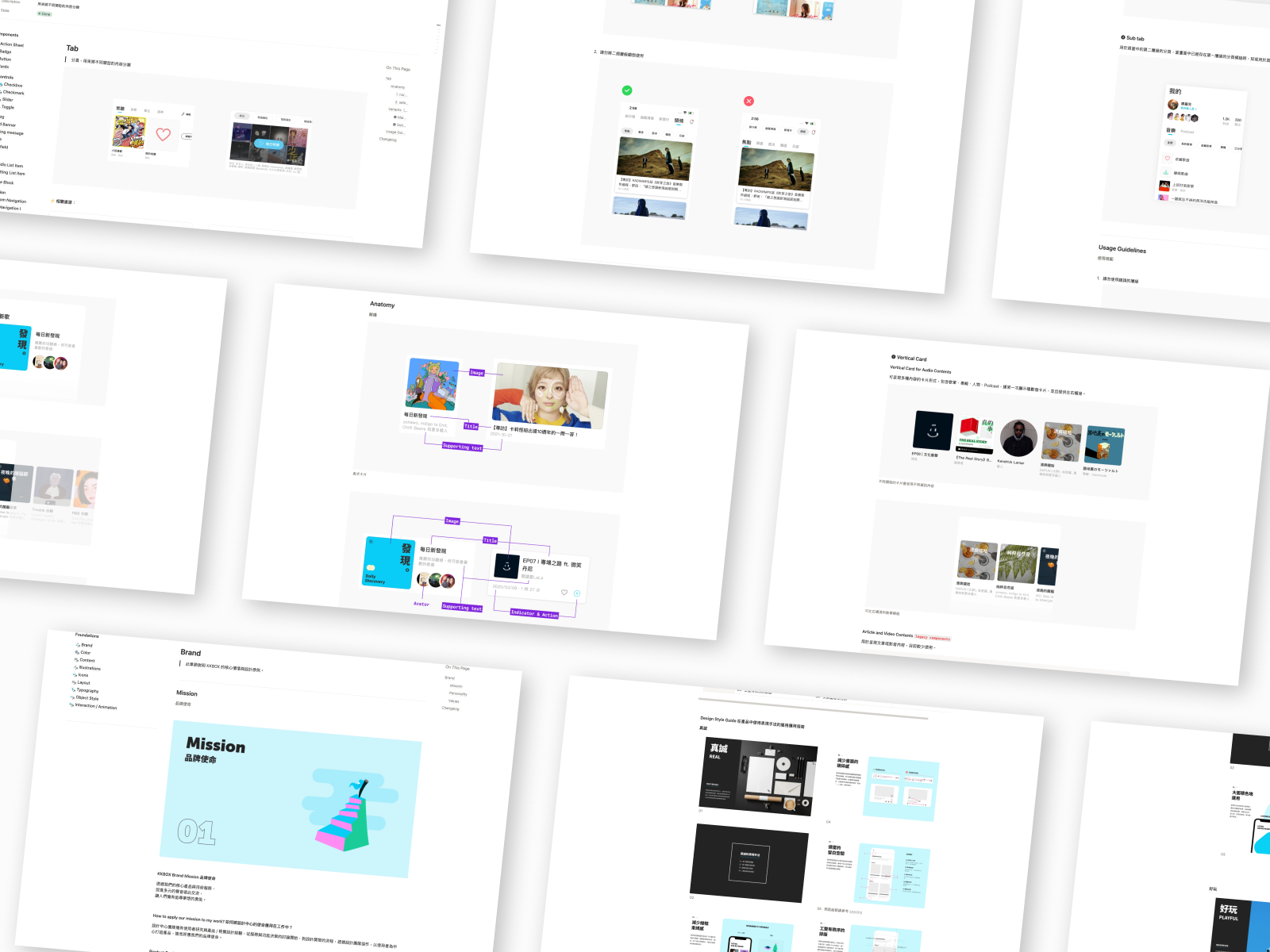
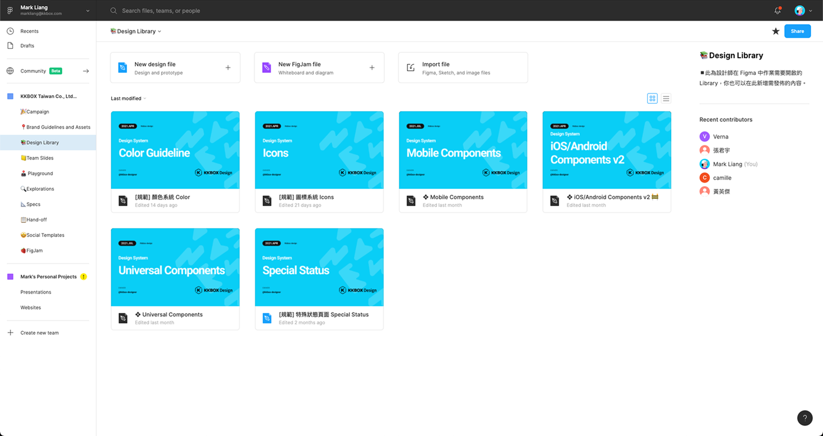
By the end of this phase, the Design Library folder in Figma contained separate files for Mobile components, Web components, the marketing templates, color system, icon system, typography, and special state pages. Designers could open a project file and pull components directly rather than hunting through old references.
Phase 4 — Engineering Bridge
Connecting the Figma system to engineering implementation was the phase we never fully completed — and I knew going in that we wouldn't. The approach of embedding component proposals into squad-level project work produced incremental wins: specific components that were discussed, aligned on, and properly implemented in the codebase as a byproduct of a feature project. But it was patchy by design, and the overall engineering coverage of the system remained incomplete.
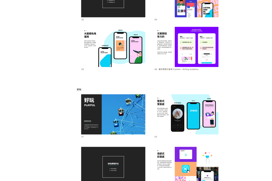
The most durable artifact from this phase was the XD Playbook — an internal documentation site we configured using Notion and Super.so. The Playbook captured component definitions, design decisions, usage guidelines, and the current implementation status of each element. It gave engineers a place to understand what the design team had intentionally defined and where each component stood, without requiring a design team member to explain it in every conversation.
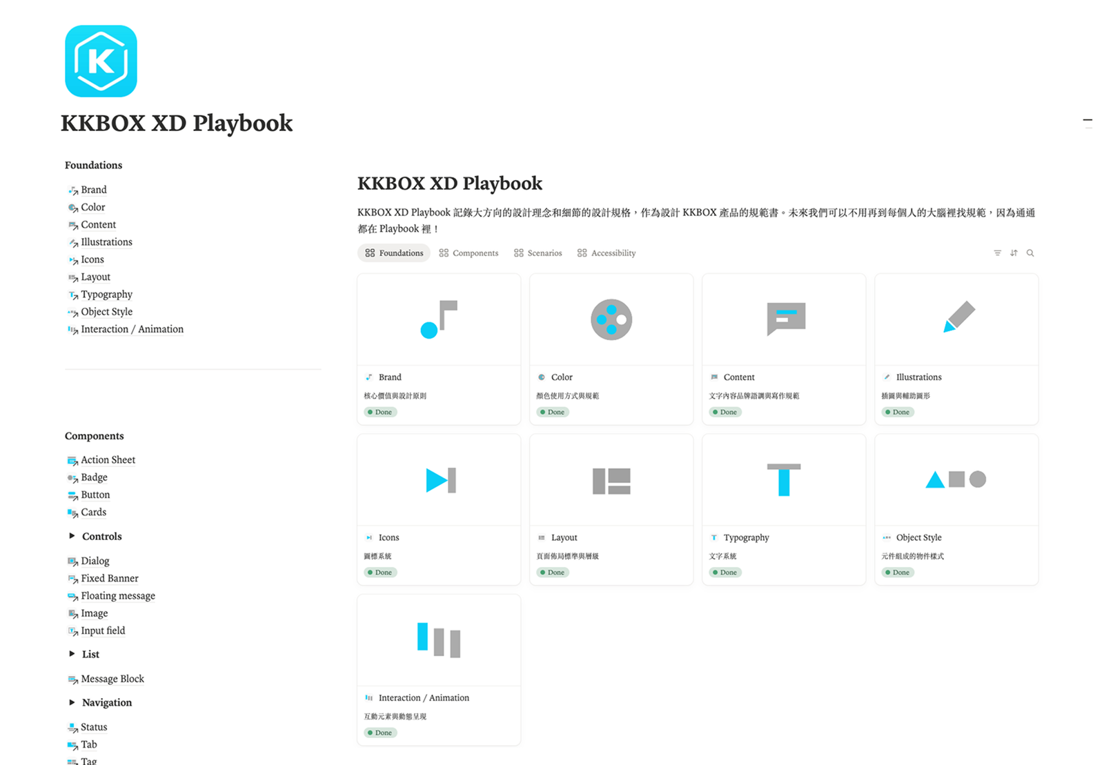
The Playbook also made the design system legible to new joiners: designers, PMs, and engineers who needed to understand how KKBOX's UI was supposed to work.
Impact
The clearest, most consistent win from the design system was designer onboarding. When new designers joined the team, they could orient themselves to the product's interface through the component library and the Playbook rather than inheriting a pile of inconsistently maintained files. What had taken weeks of archaeology — finding the right file, understanding which version was current, asking someone to explain how a component worked — shortened significantly.
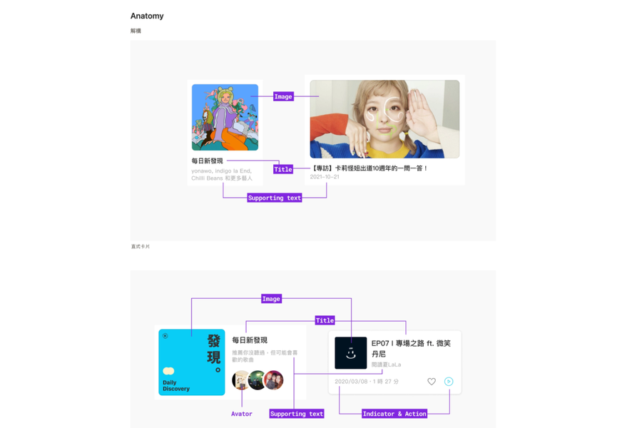
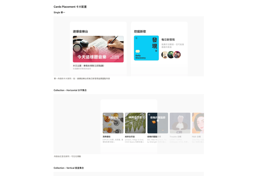
Beyond onboarding, the system changed the texture of internal design conversations. Teams stopped litigating UI decisions from first principles on every project. When a component existed in the library, it became the default, and any departure from it required explicit reasoning. That shift — from individual judgment to shared standard — was the organizational outcome the system was meant to produce.
On the engineering side, the impact was real but limited. The squad-by-squad adoption model worked where it worked, and stalled where engineering priorities didn't align. Designers who were proactive in their squads found partners willing to componentize; those in squads under delivery pressure found less room for the conversation. That variability was the cost of not having dedicated resources.
Reflection
Looking back, the scope I set at the beginning was too ambitious for the resources available — and I knew it, but I set it anyway because I wanted to preserve optionality. The cost of that was a system that reached Phase 1 through 3 with real success and Phase 4 with incomplete coverage, which made it harder for the system to iterate. A design system that isn't being applied in production has limited feedback loops for improvement.
Two things I'd do differently:
Get engineering in earlier. I treated the audit and define phases as design-led work, with engineering involved mainly during Phase 4. In hindsight, introducing engineering to the system during the audit — showing them what we were mapping and why — would have built investment before we arrived at the implementation ask.
Find a lateral champion sooner. I facilitated the system from the top down for too long. The moment a senior designer on the team started driving Playbook documentation independently, the work moved faster and felt less like a manager's project. I should have cultivated that lateral ownership in Phase 2, not Phase 4.
The broader lesson the project reinforced: a design system is a set of behaviors you're trying to make habitual — among designers, engineers, and anyone else who touches the product. The Figma library and the Playbook were tools to serve that behavioral goal. When that goal was clear, the work had direction. When it drifted toward completeness for its own sake, it lost momentum.
We built a system that stayed alive under real constraints. For a team of a few designers, running it as a side project over two years, that was the right thing to build.